Author:
Matthew Shank
Co-Authors:
Institution:
Pennsylvania Department of Environmental Protection
Abstract
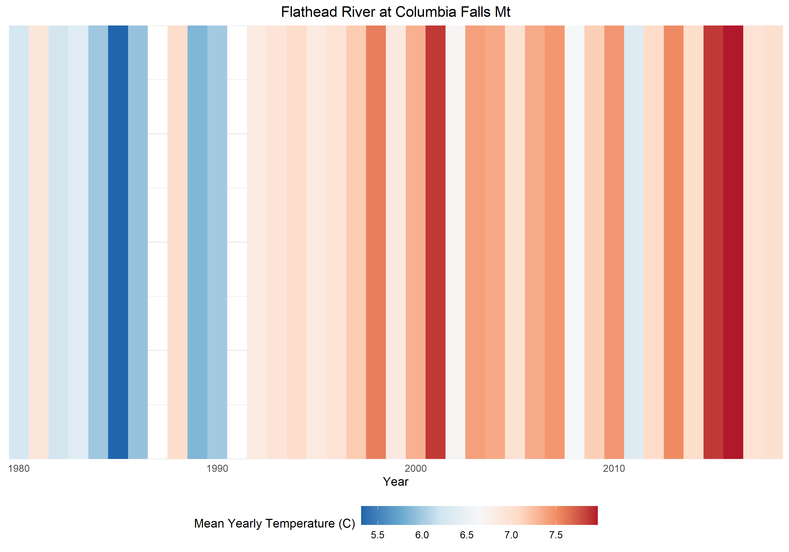
Warming stripes plots are a simple yet powerful way to convey large amounts of data. These plots show a series of bars filled with colors that represent annual temperatures, which allows clear communication of temperature changes throughout time. To date, air temperature data has most often been portrayed using warming stripes plots. I have adapted this concept to visualize water temperature data in rivers and streams. I acquired U.S. Geological Survey water temperature data across the U.S., comprised of >2.2 million observation from 224 stations across the U.S. that have been continuously monitoring water temperature for ≥10 years. These observations were summarized into mean annual temperature and presented in a website (https://fweco.shinyapps.io/gageTemp_RMd/) that allows users to view sites interactively on a map, and then view warming stripe plots of their choosing. The results demonstrate that although freshwater ecosystems are complex and dynamic, water temperatures are rising rapidly. This is consistent for watersheds in arctic and tropical climates alike. This presentation will provide an overview of the methods employed, a tutorial of the interactive website, and an invitation for those with additional data to contribute so that spatial coverage is enhanced. Currently, stations available within Pennsylvania are limited to the Delaware River watershed; datasets within the Susquehanna River are of significant interest.